OUR DEEPEST EXPLORATION OF THE UNIVERSE IN X-RAYS

eROSITA is an X-ray space telescope that was launched on July 13, 2019 by an international collaboration, mainly funded by Germany and Russia. The space telescope took its first ever X-ray image three months after orbiting the Earth the following October and has already released some of the first data collected in the first months of operation as well as a schedule confirming the official first data release by December 2022. Most recently, the Astronomy and Astrophysics peer-reviewed science journal has released a special issue including ~35 publications that analyze new eROSITA data. Given the exciting first light and the already big discoveries the telescope has made including the largest supernova remnant ever discovered in X-rays, I thought it would be appropriate to highlight a little bit more about the telescope on my blog! 😄
The eROSITA telescope flies aboard a large satellite: the Spektrum-Röntgen-Gamma (SRG) space satellite. Along with the primary instrument, eROSITA (extended ROentgen Survey with an Imaging Telescope Array), on the SRG is the Russian ART-XC instrument which can probe higher energy X-rays than eROSITA.
As you have probably guessed, this is an X-ray imaging space telescope. It turns out that the Earth’s atmosphere actually absorbs incoming X-rays (see image below).

This is precisely why all astrophysical X-ray instruments are deployed in space including eROSITA.
eROSITA is made up of seven identical and strategically aligned X-ray Mirror Assemblies (MAs) that are situated on an optical bench. Underneath this is the rest of the supporting structure (see the schematic view below), which includes connecting the MAs to the camera assemblies (CAs), i.e. the mirrors will deflect incoming X-rays from its surface in very tiny incident angles that then focus the incoming X-rays onto the cameras (called the grazing incidence angle and is a common practice for designing sensitive X-ray instruments).
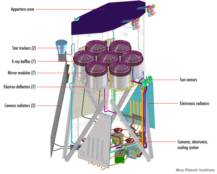
The X-ray “baffles” are used to prevent X-ray photons that are outside of the field of view from contaminating the image being taken at that time. This is particularly important when you need to observe an object that may have bright X-ray sources nearby that can contaminate the X-ray measurements.
The telescope (not SRG, the observatory it is deployed on right now) itself is 1.9 meters wide and 3.2 meters high. For my American readers that is about 6 by 10 feet! 😀 The completed instrument weighs in at a whopping 808 kg or 1781 pounds!
The Field Of View (FOV) of the full instrument (including all seven cameras) is about 1 degree in diameter. To give you an idea of what portion of the sky eROSITA can see at any given time, the full moon is about 1/2 a degree in the night sky, so eROSITA is able to see an area in the sky that is 2 times larger than the full moon.
This FOV is considerably larger than both of the previously most sensitive X-ray space telescopes, Chandra and XMM-Newton. Further, eROSITA will operate optimally for a specific energy range of X-ray photons. You will almost always see X-ray astronomy use kiloelectron volts to describe the X-ray energies,

eROSITA, along with Chandra, XMM-Newton, and several other currently operating (and retired) X-ray instruments, can detect X-ray photons between 0.2 keV and 10 keV (see image below, but don’t freak out 😉)
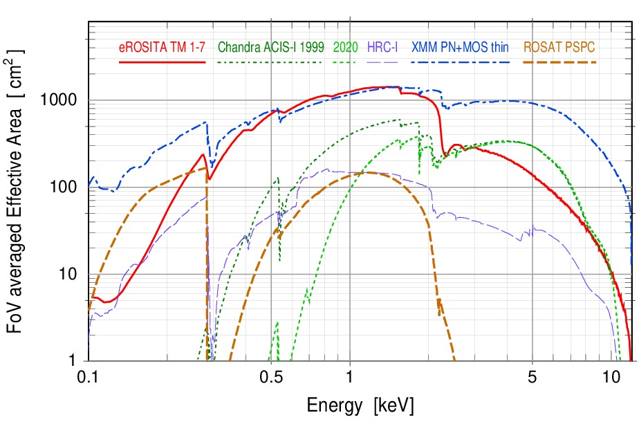
The above plot is showing the field of view averaged effective area in cm squared as a function of energy. You can think of this as the sensitivity of the instrument as a function of energy. Each line corresponds to a different instrument: eROSITA’s seven modules in solid red, Chandra’s ACIS-I setup in green dot-dashed, another Chandra instrument called HRC-I in purple dashed, XMM-Newton’s 3 cameras with the thin filter on, and the previously retired ROSAT PSCPC instrument.
You can see that eROSITA is just about the most sensitive instrument from energies ~0.5keV to ~2keV which is often referred to as the soft X-ray range which just indicates the lower energy range of the X-ray band. Above 2 keV, the sensitivity of eROSITA drops off at a similar rate as the Chandra instruments, while XMM-Newton wins the sensitivity competition at energies greater than about 2keV. With its large field of view in comparison to Chandra and XMM-Newton, eROSITA will make (and has already demonstrated) significant discoveries to X-ray astronomy.
What separates eROSITA from other current missions like Chandra, in addition to its large field of view and sensitivity, is its angular and energy resolution and most of all — the way it will take data. Chandra and XMM-Newton X-ray telescopes are pointing missions. This means the telescope has to position itself for specific observations in varying parts of the sky. The time gets “shared” among thousands of researchers who request for telescope observations every year. eROSITA, on the other hand, is an all-sky survey.
It is the first ever X-ray instrument to survey the entire sky from 0.2-10keV in astronomy HISTORY!
ROSAT was also an all-sky survey, but it only imaged soft X-ray photons, so it didn’t detect X-ray photons with energy more than 2.4keV. ROSAT also had a similar field of view of 2 degrees, but by inspecting the above effective area (i.e. sensitivity) plot, we can see that eROSITA will be a much deeper sky survey, by about 4 times!
To visualize this difference, here is a ROSAT view of the Vela supernova remnant (if you are familiar with my work you have seen the ROSAT image before) in the left panel below compared to the Vela SNR image from eROSITA on the right. I’m unable to find more details about the eROSITA image, but I’m guessing that the colors indicate three energy bands: red is likely the softest of X-rays < 0.6 keV, green is probably “medium” X-rays from 0.6 – 1-ish keV, and blue is likely 1-2.3 keV energies. If this assumption is correct, most of the Vela SNR is dominated by soft and medium X-rays (which is indeed the case, see the ROSAT image on the left lol!). We can also see the smaller overlapping supernova remnant Puppis A is bright in this X-ray range in both images, but that “hard” (higher-energy, see eROSITA image) X-rays dominate the observed emission. Additionally, one can easily spot the Vela central pulsar (lots of hard X-rays there in blue, too!) in the near-center of the eROSITA image, and a third supernova remnant in the lower left corner, visible by only a faint circular blue hue. Neither the central pulsar nor the lower-left supernova remnant is resolved in the ROSAT image. Note: do I see the third supernova remnant’s central compact object in the eROSITA image?!
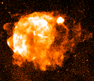
ROSAT 0.2-2.4keV view of the Vela SNR and Puppis A in the upper right corner. 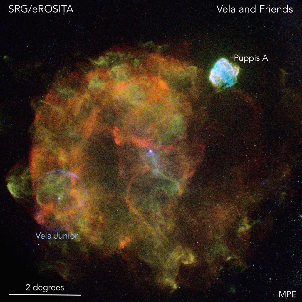
From https://www.mpe.mpg.de/7461761/news20200619
First light for the eROSITA telescope occurred in mid-October just months after launch
The first eROSITA image of the dwarf galaxy that orbits our Milky Way Galaxy, the Large Magellanic Cloud. Taken October 18-19, 2019. 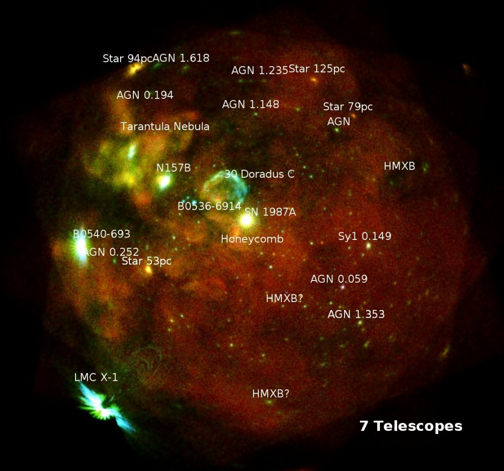
Same image as on the left but labeling bright X-ray sources. The very bright “star” in the near-center position is a famous supernova that was detected in 1987.
Moreover, eROSITA has already detected 10 times more sources than ROSAT which is about as many as have been discovered by all previous X-ray missions combined. Less than a year after launch, eROSITA has already completed its first all-sky survey, one of eight anticipated full sky surveys.
eROSITA’s first all-sky survey will be released in 2022 (well, the half that the Germans own), reporting already thousands of new sources, most being active galactic nuclei. One of the exciting discoveries includes the largest supernova remnant discovered in X-rays to date which has been nicknamed “Hoinga”. There are a lot of special surprises associated with Hoinga, including its high location with respect to the Galactic plane, an unusual location for supernova remnants to be found.
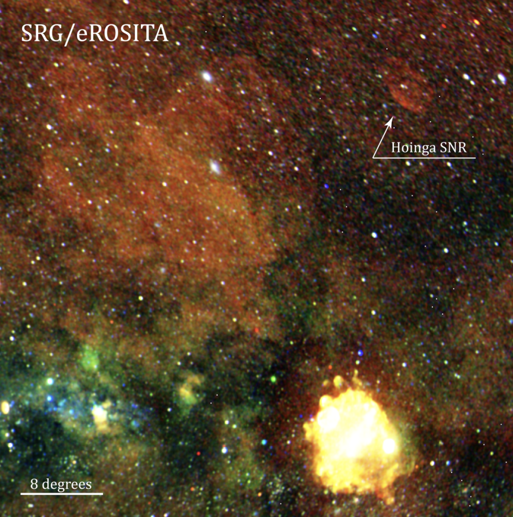
Hoinga is estimated to have a diameter of about 4.4 degrees. Vela SNR has a diameter of 8 degrees, but it was discovered first in radio, not X-ray.
To conclude, here is a super cool visual graphic about the SRG observatory where eROSITA operates.
I will definitely be on the lookout 👀 for the first data release, although that means I will have to learn (yet another) new software to clean and analyze the data….. 🥵 😅
A random side note
What I think is extra intriguing about this telescope is the collaboration between Germany and Russia (Just hear me out lol). The terms of the collaboration seem a little unusual. They have defined a German half of the X-ray sky as well as a Russia half of the X-ray sky. Essentially the Western hemisphere of the Galaxy (in Galactic coordinates) is owned by the Germans with unique scientific data exploitation rights and the Eastern hemisphere belongs to the Russians. They have decided to equally share the all-sky surveys, so I suppose the data that has been divided will include individual mission projects i.e. pointed observations for a particular object will have certain proprietary rights depending on its location in the sky. With that being said, only the German half of the sky has been scheduled a public release of data for 2022, and all of the Russian X-ray data and its release schedule is to be determined.
It will be very interesting to see how the data-sharing pans out with this particular method. To be fair, I’m not totally sure if this is a standard practice in international space efforts such as this, but I would be surprised if it is.


 in units of ergs/cm
  /s. This is the spectral flux density in units of energy per area per second. But why
  ? What does that even mean to us? How does it relate to the total flux from a source at a given frequency? And what are the perks to defining and plotting the spectral flux density?
 is useful and why that is so.
  (or nu, a greek letter), and wavelength,
  (or lambda, another greek letter):

![F_\nu = I_\nu Cos[\theta] d\theta d\phi](https://s0.wp.com/latex.php?latex=F_%5Cnu+%3D+I_%5Cnu+Cos%5B%5Ctheta%5D+d%5Ctheta+d%5Cphi+&bg=ffffff&fg=393939&s=0&c=20201002)
 /s is
/s is
 (the net flux over a given frequency) against the frequency and integrate the area under the subsequent data (see the figure below), you simply get back the total flux in that range. That’s really it. There’s no safe way to guess how much of say, the X-ray flux, compares to the gamma-ray flux just by plotting it this way. You’d have to sit down and do the math using the equations above.


 )
)

![d Log[\nu]= \frac{d\nu}{\nu}](https://s0.wp.com/latex.php?latex=d+Log%5B%5Cnu%5D%3D+%5Cfrac%7Bd%5Cnu%7D%7B%5Cnu%7D+&bg=ffffff&fg=393939&s=0&c=20201002)

 ,
,  , and
, and ![x=Log[\nu]](https://s0.wp.com/latex.php?latex=x%3DLog%5B%5Cnu%5D&bg=ffffff&fg=393939&s=0&c=20201002) .
.
 versus the
 ![Log[\nu]](https://s0.wp.com/latex.php?latex=Log%5B%5Cnu%5D&bg=ffffff&fg=393939&s=0&c=20201002) and get a lot more information (over a wider range of frequencies!). There are a lot of special things about this trick but the main one I want to emphasize is that plotting this way, we can see where the total flux is being dominated. Look at the example of another spectral energy distribution (SED) shown below.
and get a lot more information (over a wider range of frequencies!). There are a lot of special things about this trick but the main one I want to emphasize is that plotting this way, we can see where the total flux is being dominated. Look at the example of another spectral energy distribution (SED) shown below.
 enables us to immediately understand what part of the electromagnetic spectrum being generated from some source is dominating the observed flux. i.e. how bright is it in one energy range from another?

 is the photons per area per second, thus
  is the change with energy, and E and
  are related. I’ll leave this up to you to ponder (and the pdf linked at the beginning has some extra insight to this!)
 to more than
  ergs/cm
 MeV. That’s EIGHT orders of magnitude!