We saw last time a plot just like this:

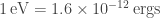
 in units of ergs/cm
  /s. This is the spectral flux density in units of energy per area per second. But why
  ? What does that even mean to us? How does it relate to the total flux from a source at a given frequency? And what are the perks to defining and plotting the spectral flux density?
Linked are two sources:
1) This source is designed for astrophysics graduate students. It explains when the common 
2) This source is more user friendly and explains things a little more generally.
 (or nu, a greek letter), and wavelength,
  (or lambda, another greek letter):
where c is the speed of light. Recall that the energy of a single photon with wavelength
is:
where h is Planck’s constant.
Now, net flux is defined as the intensity at a given wavelength observed over all directions. In theory, we assume the intensity is isotropic, or the same in any direction. That means the net flux observed in a given wavelength is assumed to be isotropic in all directions, too. This is not necessarily true across the light spectrum though, because this only defines the net flux measurement in one given wavelength!!
This can be mathematically expressed as the following.
![F_\nu = I_\nu Cos[\theta] d\theta d\phi](https://s0.wp.com/latex.php?latex=F_%5Cnu+%3D+I_%5Cnu+Cos%5B%5Ctheta%5D+d%5Ctheta+d%5Cphi+&bg=ffffff&fg=393939&s=0&c=20201002)
Where the intensity is variable on frequency and thus, so is the flux. Integrating over all angles like this gives you the net flux.
To find the total flux observed in a given frequency range (i.e. from frequency v to some other frequency v’ ) in units of ergs/cm

You might be thinking: Well, oh okay, this is the same units as the plot above so we must be done and that’s how we plot spectral energy distributions. Sorry, but you would be wrong! You certainly can plot F vs. v but you wouldn’t be able to look right at the plot and see what frequency ranges dominate the flux density, i.e. what frequencies of light are more abundant from this source than other frequencies.
 (the net flux over a given frequency) against the frequency and integrate the area under the subsequent data (see the figure below), you simply get back the total flux in that range. That’s really it. There’s no safe way to guess how much of say, the X-ray flux, compares to the gamma-ray flux just by plotting it this way. You’d have to sit down and do the math using the equations above.
This is where our funky notation and definition for the spectral flux density comes in!

Note: this is essentially the same as using wavelength (
), converting by just using the relationship above using the speed of light. This is also essentially the same as 
by making a few rearrangements using the relationship between energy and frequency. In my field of high energy astrophysics, we don’t really talk about photon energies in terms of wavelength or frequency. I don’t really know why – I suppose because frequencies are really large and wavelengths are very, very small in the high energy regime. Instead, we speak of its energy. This is why, in all of my posts, I refer to the X-ray range in energy units. For example, the soft energy range of X-rays (i.e. low energy X-rays) are defined as 0.5-10keV. keV means kilo-electronvolt. It’s just another unit of energy. Any unit of energy can be converted into another. ergs is also a unit of energy. And Joules. And Calories!
(the prefixes here are just referencing the orders of magnitude. They can be Googled easily!)
For good measure,


We want
Start with
Get a fancy one in there (i.e. 3/3 = 1 so
 )
)
or

You might need more math to understand this next jump but you can trust me it’s a solid thing to say.
![d Log[\nu]= \frac{d\nu}{\nu}](https://s0.wp.com/latex.php?latex=d+Log%5B%5Cnu%5D%3D+%5Cfrac%7Bd%5Cnu%7D%7B%5Cnu%7D+&bg=ffffff&fg=393939&s=0&c=20201002)
Such that

To generalize, recall the slope of a curve is m and is related to the axes by y=mx. In this case,
 ,
,  , and
, and ![x=Log[\nu]](https://s0.wp.com/latex.php?latex=x%3DLog%5B%5Cnu%5D&bg=ffffff&fg=393939&s=0&c=20201002) .
.
You can plot 
![Log[\nu]](https://s0.wp.com/latex.php?latex=Log%5B%5Cnu%5D&bg=ffffff&fg=393939&s=0&c=20201002)

You can tell just by looking at the graph – no calculations necessary! This is a huge perk.
 enables us to immediately understand what part of the electromagnetic spectrum being generated from some source is dominating the observed flux. i.e. how bright is it in one energy range from another?
From this we can show

because
 is the photons per area per second, thus
  is the change with energy, and E and
  are related. I’ll leave this up to you to ponder (and the pdf linked at the beginning has some extra insight to this!)
More on the logarithmic scales….
The y-axis is plotted from order 

The x-axis is plotted from 1 MeV to over 
To put this into perspective, take the ratios. For the y-axis,

and for the x-axis,
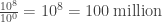
These are huge ranges we are trying to plot over. This is exactly why you see the plot axes looking so funky. It’s plotted in logarithmic scale to be able to fit all of this measured data onto one plot. Plotting in logarithm base ten allows us to plot fluxes versus their corresponding energies over a wide range of energies by creating equally spaced axes based on their order of magnitude.

Pingback: A DISTANT, COMPLEX SUPERNOVA REMNANT G344.7-0.1 – JORDAN L. EAGLE